Identifying the scariest season of Stranger Things using sentiment analysis
In honor of Halloween, this post involves a spooky analysis. I’m going to take advantage of the #TidyTuesday dataset from a couple weeks ago, which was dialogue from the fantastic show Stranger Things. The objective: 1) Figure out which season of Stranger Things was the scariest, and 2) make a cool Stranger Things-themed plot to show the results.
To determine the “scariness” of a given season, I’m going analyze the sentiment of dialogue (focusing on fear) and look at how this sentiment changes across the course of the show.
Let’s get started!
Loading data and relevant packages
First I need to load relevant packages and download the data. For this analysis, we’ll only need the tidytext package and the tidyverse. The data can be downloaded directly from GitHub.
pacman::p_load(tidytext, tidyverse)


stranger_things <- read_csv('https://raw.githubusercontent.com/rfordatascience/tidytuesday/master/data/2022/2022-10-18/stranger_things_all_dialogue.csv')
## Rows: 32519 Columns: 8
## ── Column specification ────────────────────────────────────────────────────────
## Delimiter: ","
## chr (3): raw_text, stage_direction, dialogue
## dbl (3): season, episode, line
## time (2): start_time, end_time
##
## ℹ Use `spec()` to retrieve the full column specification for this data.
## ℹ Specify the column types or set `show_col_types = FALSE` to quiet this message.Let’s take a look at what we’re dealing with.
glimpse(stranger_things)## Rows: 32,519
## Columns: 8
## $ season <dbl> 1, 1, 1, 1, 1, 1, 1, 1, 1, 1, 1, 1, 1, 1, 1, 1, 1, 1, …
## $ episode <dbl> 1, 1, 1, 1, 1, 1, 1, 1, 1, 1, 1, 1, 1, 1, 1, 1, 1, 1, …
## $ line <dbl> 1, 2, 3, 4, 5, 6, 7, 8, 9, 10, 11, 12, 13, 14, 15, 16,…
## $ raw_text <chr> "[crickets chirping]", "[alarm blaring]", "[panting]",…
## $ stage_direction <chr> "[crickets chirping]", "[alarm blaring]", "[panting]",…
## $ dialogue <chr> NA, NA, NA, NA, NA, NA, NA, NA, "Something is coming. …
## $ start_time <time> 00:00:07, 00:00:49, 00:00:52, 00:01:01, 00:01:09, 00:…
## $ end_time <time> 00:00:09, 00:00:51, 00:00:54, 00:01:02, 00:01:10, 00:…Okay, so we have a variable for season, episode, the line number from a given episode, dialogue and stage_direction, as well as time markers for each line within a given episode. I’m not sure what the “raw_text” variable is, so let’s take a look at some examples of it.
stranger_things %>%
  select(raw_text, stage_direction, dialogue) %>%
  slice(1:10)
## # A tibble: 10 × 3
## raw_text stage…¹ dialo…²
## <chr> <chr> <chr>
## 1 [crickets chirping] [crick… <NA>
## 2 [alarm blaring] [alarm… <NA>
## 3 [panting] [panti… <NA>
## 4 [elevator descending] [eleva… <NA>
## 5 [elevator dings] [eleva… <NA>
## 6 [breathing heavily] [breat… <NA>
## 7 [low growling] [low g… <NA>
## 8 [screaming] [screa… <NA>
## 9 [Mike] Something is coming. Something hungry for blood. [Mike] Someth…
## 10 A shadow grows on the wall behind you, swallowing you in dar… <NA> A shad…
## # … with abbreviated variable names ¹stage_direction, ²dialogueAha! It appears that the raw_text variable is simply a combination of the stage direction column and the dialogue. Since we’re interested in capturing the “scariness” of the text, I think it makes sense to include both dialogue and stage direction in the sentiment analysis, as the stage directions include information about scenes beyond what is said by characters. We’ll use this raw_text column as our main variable in the analysis.
Cleaning up the data and doing some pre-processing
Before we get analyzing, we need to clean up and prep the data a bit. The first thing to consider is how we’re going to divvy up the data: while I said we’re interested in looking how scary season are overall, it may be interesting to also look at episodes within seasons. Then, the scariness of a given season could be determined by the average scariness of a season’s episodes, and we can also do fun stuff like look at how scariness changes over the course of a given season. With this in mind, it will be useful to create a variable that uniquely identifies season-episode combinations.
Now that we’ve determined we’re going to consider episodes as a unit, we need some way of standardizing them, because episodes vary in all sorts of ways like total length, number of lines, etc. Because we want to measure scariness of an episode, I think it makes sense to measure something like average scariness across an episode. In other words, we’ll use the overall measure of scariness (however we calculate that) divided by the length of the episode. That way, our measure of a given episode’s scariness accounts for differences in length. So, we need to also create a variable that includes the length of an episode. Because we have the start and end times for each line, we can simply take the end time from the last line of each episode, and that will give us the ending time of each episode (i.e., the overall length of an episode.)
data_r <-
  stranger_things %>%
  mutate(season_episode = paste0(season,"_",episode)) %>%
  select(season_episode,
         text = raw_text,
         end_time)

head(data_r)
## # A tibble: 6 × 3
## season_episode text end_time
## <chr> <chr> <time>
## 1 1_1 [crickets chirping] 00'09"
## 2 1_1 [alarm blaring] 00'51"
## 3 1_1 [panting] 00'54"
## 4 1_1 [elevator descending] 01'02"
## 5 1_1 [elevator dings] 01'10"
## 6 1_1 [breathing heavily] 01'17"Okay, now we have a tibble containing a unique season-episode variable, a text variable that includes stage direction and dialogue, and the ending time of each line. With these variables in hand, we can now figure out the length of each episode.
There are a few ways to do this, but I think the simplest approach is to create a separate tibble with just the episode length and episode ID, and then join that tibble with the full dataset.
(
episode_lengths <-
  data_r %>%
  group_by(season_episode) %>%
  slice_tail(n = 1) %>%  # grabbing last line of each episode
  select(season_episode,
         episode_length = end_time)
)
## # A tibble: 34 × 2
## # Groups: season_episode [34]
## season_episode episode_length
## <chr> <time>
## 1 1_1 46'19"
## 2 1_2 53'02"
## 3 1_3 49'21"
## 4 1_4 48'08"
## 5 1_5 50'38"
## 6 1_6 44'25"
## 7 1_7 39'37"
## 8 1_8 52'11"
## 9 2_1 45'09"
## 10 2_2 54'27"
## # … with 24 more rowsNice! Now that’s we have our episode_length variable, we can add it back with the full data.
data_r <-
  inner_join(data_r, episode_lengths) %>%
  select(-end_time) # getting rid of end_time variable
## Joining, by = "season_episode"glimpse(data_r)## Rows: 32,519
## Columns: 3
## $ season_episode <chr> "1_1", "1_1", "1_1", "1_1", "1_1", "1_1", "1_1", "1_1",…
## $ text <chr> "[crickets chirping]", "[alarm blaring]", "[panting]", …
## $ episode_length <time> 00:46:19, 00:46:19, 00:46:19, 00:46:19, 00:46:19, 00:4…There we go! Okay, now that we have the necessary variables, we need to restructure the data into a format ready for analysis. I’ll be using a tidytext approach here, which means that we want a one-row-per-token format. For our purposes, a token will be individual words. To do this, we’ll use the unnest_tokens() function from the tidytext package. This function takes a character vector, does some preprocessing (such as lowercasing and removing punctuation), and tokenizes the text (i.e., separates each word by row).
tokens <-
  data_r %>%
  unnest_tokens("word", "text")

head(tokens)
## # A tibble: 6 × 3
## season_episode episode_length word
## <chr> <time> <chr>
## 1 1_1 46'19" crickets
## 2 1_1 46'19" chirping
## 3 1_1 46'19" alarm
## 4 1_1 46'19" blaring
## 5 1_1 46'19" panting
## 6 1_1 46'19" elevatorAs you can see, the text column has been replaced with a column called word which, as it sounds, contains individuals words. Now we’re ready to do some analyses!
Analyzing sentiment in episodes
There many ways to perform sentiment analyses on text data, ranging from fairly simple (i.e. using available sentiment dictionaries) to pretty complicated (using sophisticated models such as transformers). For this analysis, we’re gonna stick to a fairly simple approach, which is to use a sentiment dictionary. In short, these are datasets that contain large lists of words and their associated sentiments. With this dictionary, one can then assign sentiments to words in their text data, and look at whatever patterns they are interested in using the sentiment attributions of the words in their data.
While some dictionaries only include negative or positive classification, others provide a larger range of sentiments. Because we’re interested in capturing “scariness” in episodes, looking at overall “negativity” in episodes might capture something like scariness, but a better measurement would be something like fear. Luckily one of the sentiment dictionaries (nrc) includes fear, and this dictionary is included with the tidytext package! You can access sentiment dictionaries within tidytext with the get_sentiments() function.
Here’s what the nrc dictionary looks like:
get_sentiments("nrc") %>%
  head()
## # A tibble: 6 × 2
## word sentiment
## <chr> <chr>
## 1 abacus trust
## 2 abandon fear
## 3 abandon negative
## 4 abandon sadness
## 5 abandoned anger
## 6 abandoned fearSo again, this is pretty simple: we have a column of words and their associated sentiments. One thing thing to note, though, is that words can have multiple sentiments attached to them, which makes sense of course, because words can have different meaning in different contexts. This is one of the drawbacks of using a simple dictionary approach like this for sentiment analysis, as the possibility of polysemy (i.e., many possible meanings for a word) can’t be accounted for. We’re going to basically ignore this issue and say that if a word in our Stranger Things data has the potential to have a sentiment of fear, we’ll go ahead and assign it as having the sentiment of fear. This is a pretty crude way of performing sentiment analysis, but for our purposes, it’s fine. Also, because our primary interest is comparing changes in sentiment across a variable (episodes/seasons), even if our measure of scariness in a given episode isn’t perfect, we should still be able to detect changes in scariness across episodes fairly well.
Calculating “scariness” in episodes
We could calculate episode “scariness” in many different ways, but one simple and intuitive approach would be to look at the total count of words in a given episode that have a sentiment designation of “fear”. We can then normalize that count by our episode_time variable, which would result in a “scariness” measure that indicates the amount of fear per minute in each episode. Not perfect, but a reasonable approach.
The first step is to reduce that sentiment dictionary down to only words that have an associated sentiment of “fear”. We’ll save this as a new object called “fear”.
fear <-
  get_sentiments("nrc") %>%
  filter(sentiment == "fear")

head(fear)
## # A tibble: 6 × 2
## word sentiment
## <chr> <chr>
## 1 abandon fear
## 2 abandoned fear
## 3 abandonment fear
## 4 abduction fear
## 5 abhor fear
## 6 abhorrent fearOkay, now that we have our list of “fear” words, we can use this to identify “fear” words in our Stranger Things data. Once we identify the fear words in our data, we can get a count for each episode. Let’s do it!
data_fear <-
  tokens %>%
  filter(word %in% fear$word) #only including words that are in "fear"

head(data_fear, n = 20)
## # A tibble: 20 × 3
## season_episode episode_length word
## <chr> <time> <chr>
## 1 1_1 46'19" alarm
## 2 1_1 46'19" growling
## 3 1_1 46'19" screaming
## 4 1_1 46'19" darkness
## 5 1_1 46'19" risky
## 6 1_1 46'19" die
## 7 1_1 46'19" god
## 8 1_1 46'19" god
## 9 1_1 46'19" god
## 10 1_1 46'19" god
## 11 1_1 46'19" god
## 12 1_1 46'19" god
## 13 1_1 46'19" ruin
## 14 1_1 46'19" elf
## 15 1_1 46'19" kill
## 16 1_1 46'19" bitch
## 17 1_1 46'19" growling
## 18 1_1 46'19" growling
## 19 1_1 46'19" growling
## 20 1_1 46'19" unknownAlright, we have all of the “fear” words for each episode! Just from looking at the first 20 words, we can already see where polysemy could be an issue. “growling”, “screaming”, and “darkness” all make perfect sense, but words like “alarm” and “god” could be categorized as fear in some contexts, but definitely not in others. So our list here is not perfect, but we should still get some meaningful results when looking at differences across episodes.
Now that we’ve reduced our data to “fear” words, we need to get counts across each episode. So, that means that we want the number of rows for each season_episode.
data_fear_counts <-
  data_fear %>%
  group_by(season_episode) %>%
  mutate(fear_total = n()) %>%
  distinct(season_episode, episode_length, fear_total) # getting distinct rows of episode, length, and count

head(data_fear_counts)
## # A tibble: 6 × 3
## # Groups: season_episode [6]
## season_episode episode_length fear_total
## <chr> <time> <int>
## 1 1_1 46'19" 76
## 2 1_2 53'02" 89
## 3 1_3 49'21" 56
## 4 1_4 48'08" 88
## 5 1_5 50'38" 76
## 6 1_6 44'25" 82Beautiful! Let’s plot the totals across episodes to see if any initial trends emerge.
data_fear_counts %>%
  ggplot(aes(x = season_episode, y = fear_total, group = 1)) +
  geom_point() +
  geom_line() +
  theme(axis.text.x = element_text(angle = 90))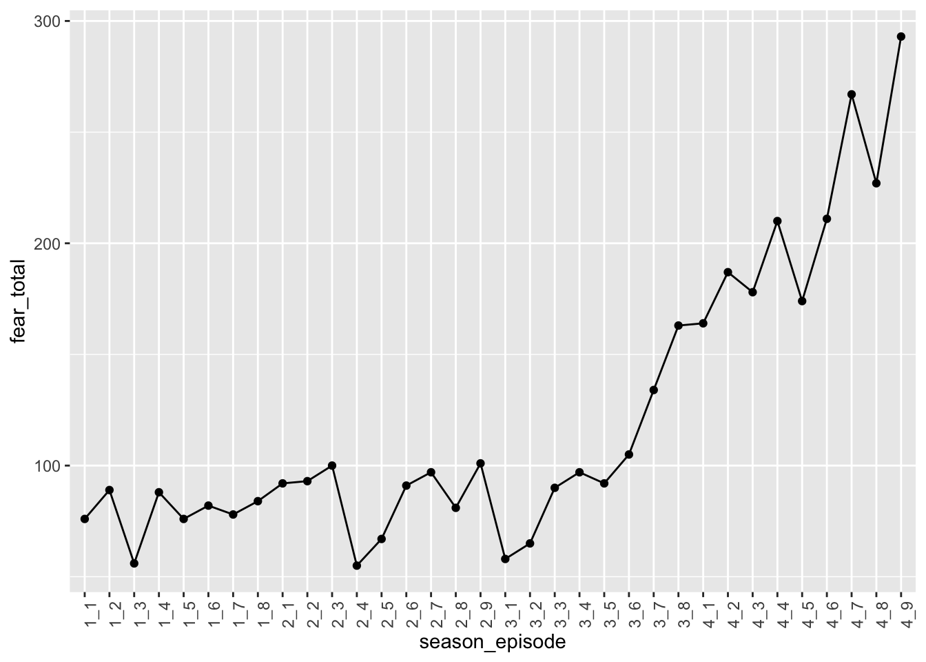
At first glace, it looks like the clearest trend is that that Season 4 is by far the scariest! However, remember that episode lengths do vary, and I believe that they were longer on average in Season 4. Let’s check this by plotting episode lengths across episodes.
data_fear %>%
  ggplot(aes(x = season_episode, y = episode_length, group = 1)) +
  geom_point() +
  geom_line() +
  theme(axis.text.x = element_text(angle = 90))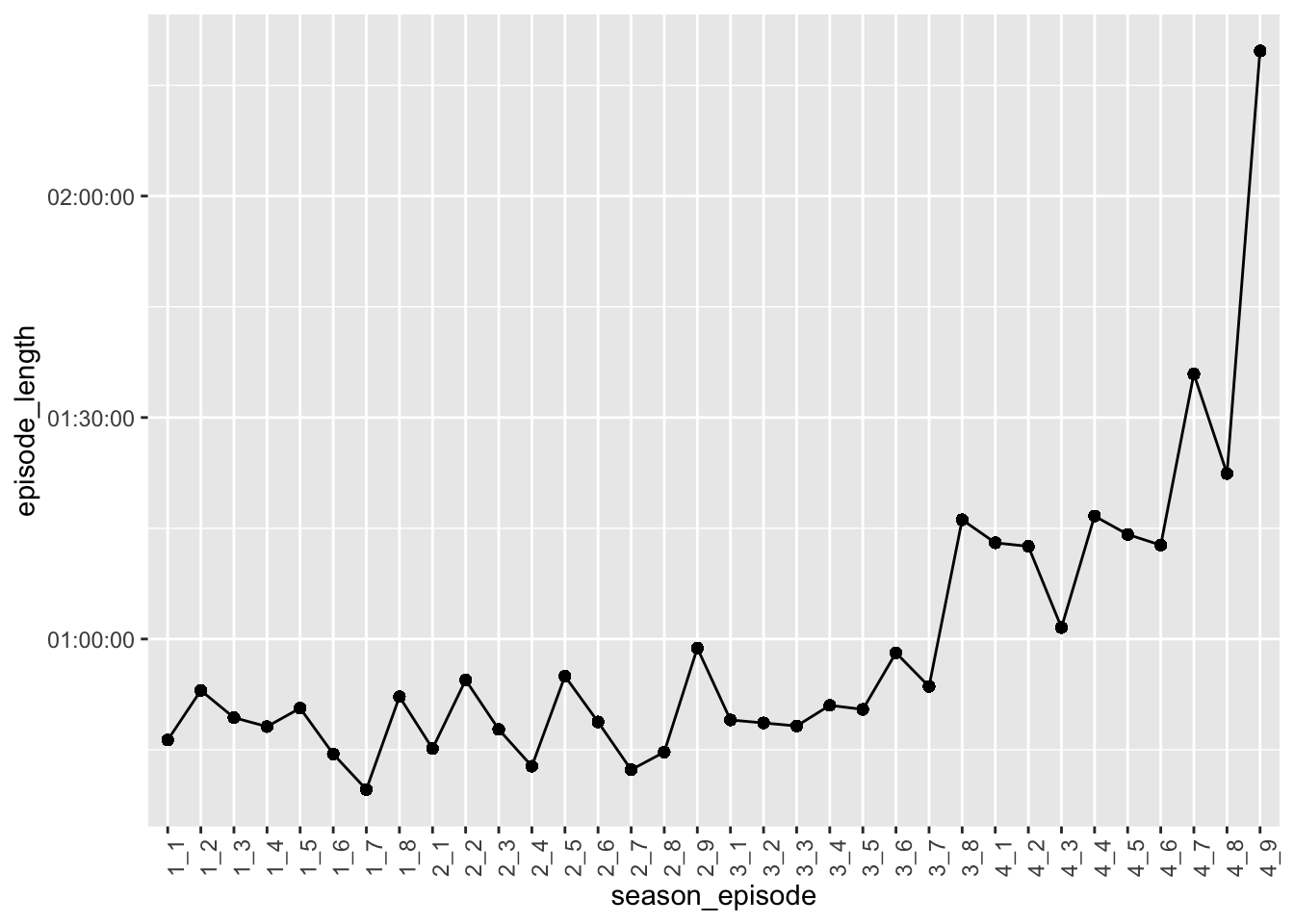
Pattern look familiar? Looks like episode times follow a pretty similar trend to the trend we observed with fear over time. This suggests that episode length at least in part explains why season 4 appears to be the scariest. Let’s account for this by creating a normalized fear count, taking into account the episode lengths.
data_fear_norm <-
  data_fear_counts %>%
  mutate(seconds = as.numeric(episode_length), #numeric transformation of hms becomes seconds
         fear_per_sec = fear_total/seconds)  # creating fear per second variable


head(data_fear_norm)
## # A tibble: 6 × 5
## # Groups: season_episode [6]
## season_episode episode_length fear_total seconds fear_per_sec
## <chr> <time> <int> <dbl> <dbl>
## 1 1_1 46'19" 76 2779 0.0273
## 2 1_2 53'02" 89 3182 0.0280
## 3 1_3 49'21" 56 2961 0.0189
## 4 1_4 48'08" 88 2888 0.0305
## 5 1_5 50'38" 76 3038 0.0250
## 6 1_6 44'25" 82 2665 0.0308Great! Okay, now let’s try plotting fear trends again with our new normalized measure.
data_fear_norm %>%
  ggplot(aes(season_episode, y = fear_per_sec, group = 1)) +
  geom_point() +
  geom_line() +
  theme(axis.text.x = element_text(angle = 90))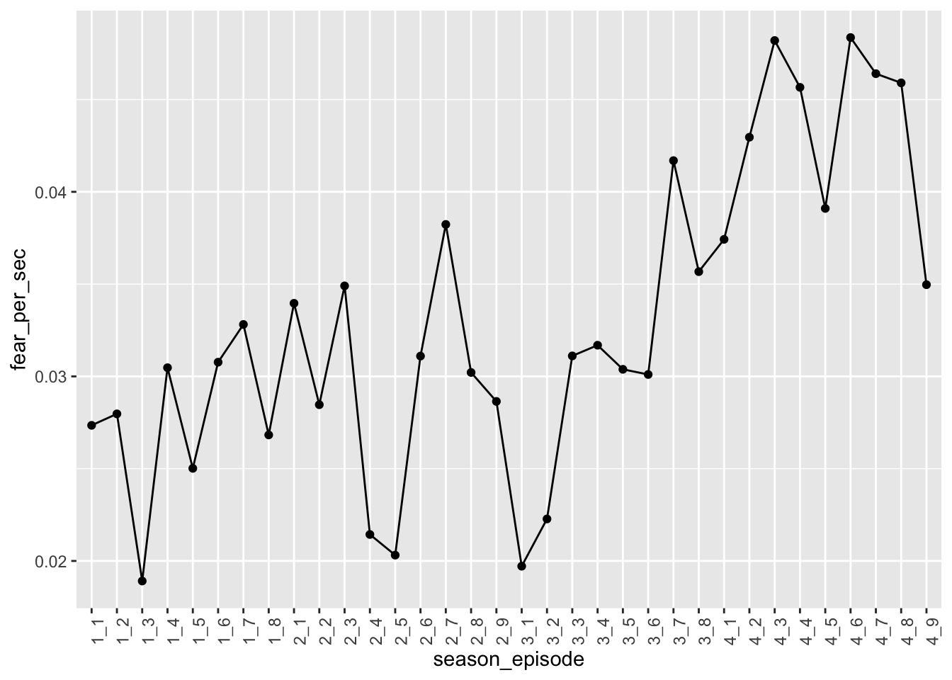
Interesting! Looks like season 4 indeed elicited the most fear! There’s also quite a bit of variation within season. Let’s recreate this plot, but with separate facets for each season. To do this, we’ll need to create a season variable once again. Also, while we’re at it, let’s calculate the average fear per episode across the seasons, so we can more formally compare the differences across seasons.
data_fear_norm_r <-
  data_fear_norm %>%
  separate(season_episode, c("season","episode"), remove = FALSE) %>%
  group_by(season) %>%
  mutate(avg_fear = mean(fear_per_sec))

head(data_fear_norm_r)
## # A tibble: 6 × 8
## # Groups: season [1]
## season_episode season episode episode_length fear_to…¹ seconds fear_…² avg_f…³
## <chr> <chr> <chr> <time> <int> <dbl> <dbl> <dbl>
## 1 1_1 1 1 46'19" 76 2779 0.0273 0.0275
## 2 1_2 1 2 53'02" 89 3182 0.0280 0.0275
## 3 1_3 1 3 49'21" 56 2961 0.0189 0.0275
## 4 1_4 1 4 48'08" 88 2888 0.0305 0.0275
## 5 1_5 1 5 50'38" 76 3038 0.0250 0.0275
## 6 1_6 1 6 44'25" 82 2665 0.0308 0.0275
## # … with abbreviated variable names ¹fear_total, ²fear_per_sec, ³avg_feardata_fear_norm_r %>%
ggplot(aes(x = episode, y = fear_per_sec, group = 1)) +
geom_point() +
geom_line() +
facet_wrap(~ season)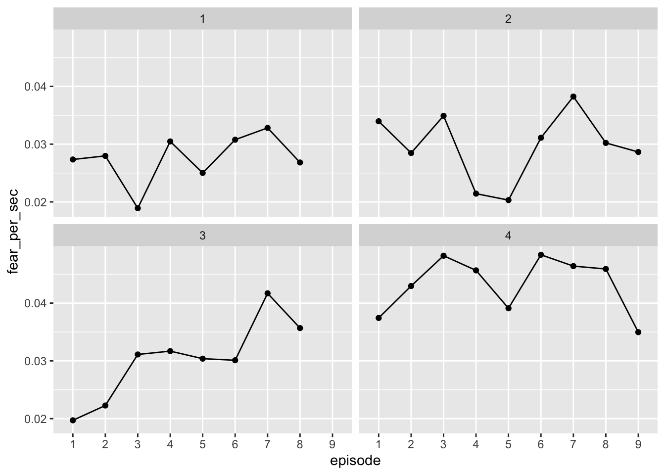 # Making cool plot!
Excellent! Okay, I think we’re ready to start turning our results into a cool Stranger Things-themed plot. First, we need to figure out how we want this plot organized before we start messing with the fun stuff like color and fonts. It’d be nice to keep the plots separated season but still be able to compare levels across seasons. What if we put each facet in the same row?
# Making cool plot!
Excellent! Okay, I think we’re ready to start turning our results into a cool Stranger Things-themed plot. First, we need to figure out how we want this plot organized before we start messing with the fun stuff like color and fonts. It’d be nice to keep the plots separated season but still be able to compare levels across seasons. What if we put each facet in the same row?
data_fear_norm_r %>%
ggplot(aes(x = episode, y = fear_per_sec, group = 1)) +
geom_point() +
geom_line() +
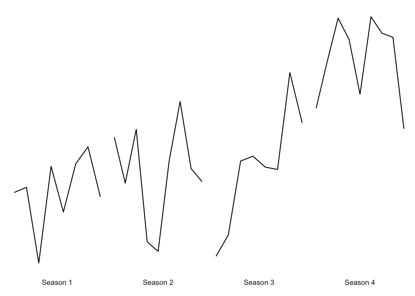
facet_wrap(~ season, ncol = 4)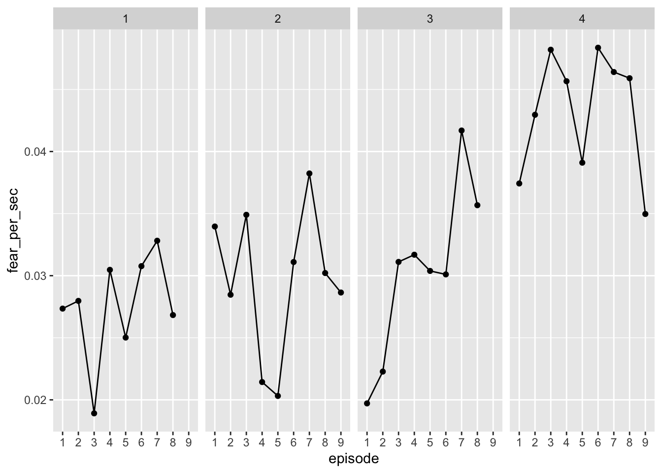 That works! We can make these labels prettier though. Let’s add “Season” to the facet labels and an “Ep.” prefix to the episode. And while we’re add it, let’s remove the axis labels. Oh, and the y-axis ticks aren’t all that informative either, so let’s remove though – but we’ll be sure to make it clear what the patterns indicate!
data_fear_norm_r %>%
mutate(season = paste("Season",season),
episode_l = paste("Ep.",episode)) %>%
ggplot(aes(x = episode_l, y = fear_per_sec, group = 1)) +
geom_point() +
geom_line() +
labs(
x = NULL,
y = NULL
) +
facet_wrap(~ season, ncol = 4) +
theme(axis.text.x = element_text(angle = 90),
axis.text.y = element_blank(),
axis.ticks.y = element_blank())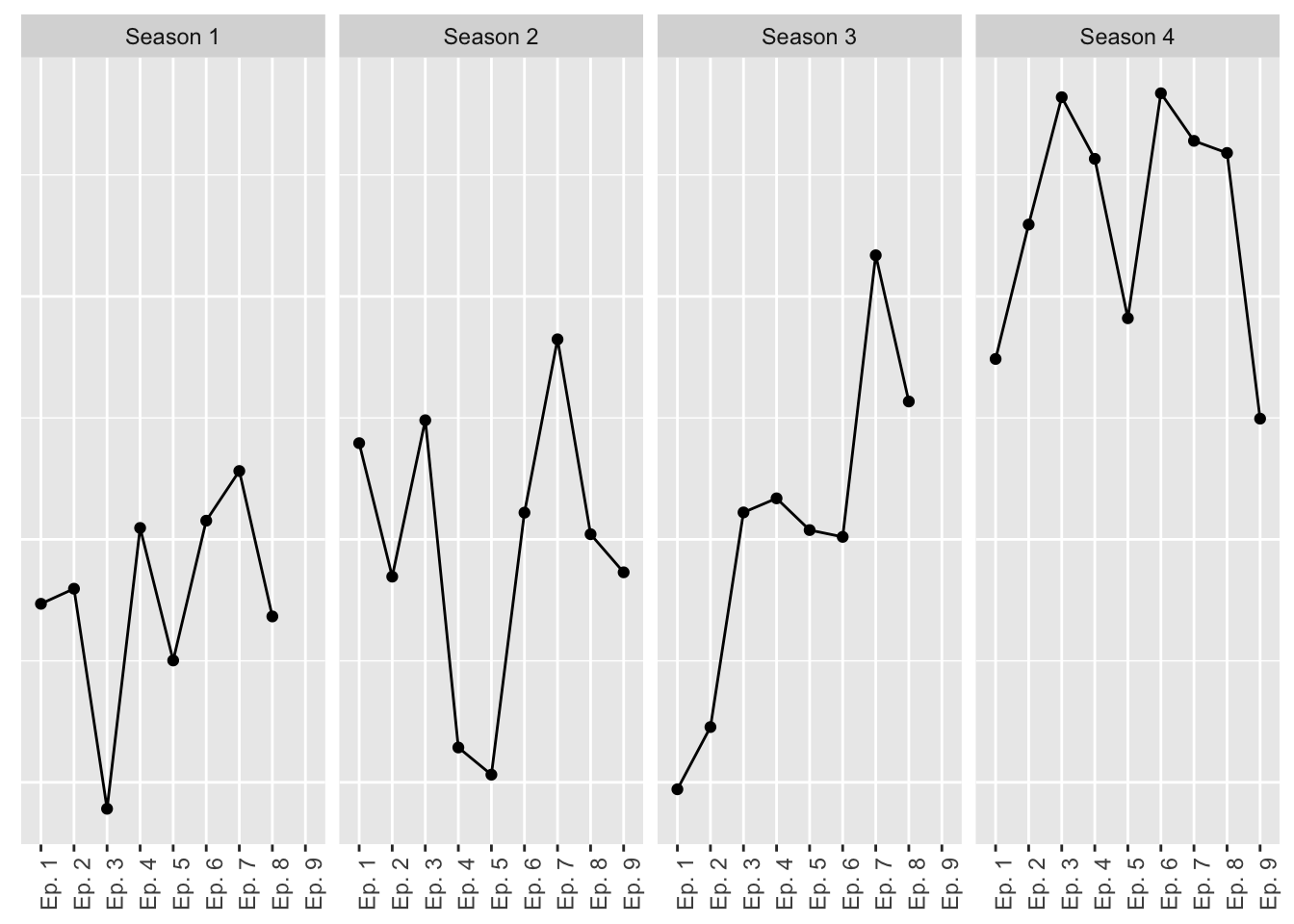 Now we’re getting somewhere! Okay, now let’s start tweaking the fun stuff. First, let’s clean up the overall look of the plot by removing unnecessary lines and text.
data_fear_norm_r %>%
  mutate(season = paste("Season",season),
         episode_l = paste("Ep.",episode)) %>%
  ggplot(aes(x = episode_l, y = fear_per_sec, group = 1)) +
  geom_line() +
  labs(
    x = NULL,
    y = NULL
  ) +
  facet_wrap(~ season, ncol = 4) +
  theme(axis.text.x = element_blank(),
        axis.ticks.x = element_blank(),
        axis.text.y = element_blank(),
        axis.ticks.y = element_blank(),
        panel.grid = element_blank(),
        strip.background = element_blank(),
        panel.background = element_blank()
        )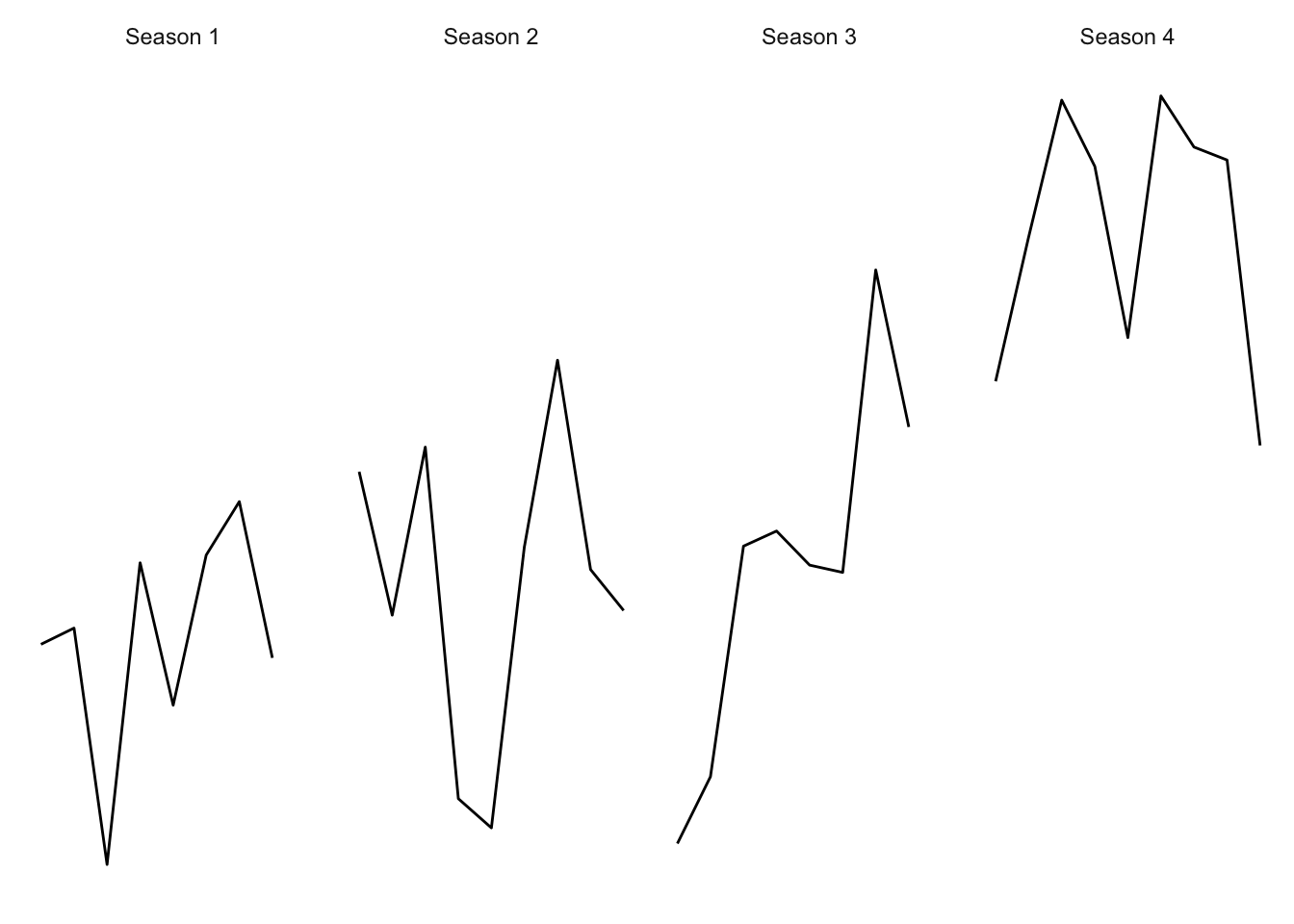
This looks a little sparse now, but we’ll liven it up when we start adding text. More more thing before we get to color: let’s move the facet labels to appear underneath the lines, and let’s also move the facets a little close together.
data_fear_norm_r %>%
  mutate(season = paste("Season",season),
         episode_l = paste("Ep.",episode)) %>%
  ggplot(aes(x = episode_l, y = fear_per_sec, group = 1)) +
  geom_line() +
  labs(
    x = NULL,
    y = NULL
  ) +
  facet_wrap(~ season, ncol = 4, strip.position = "bottom", scales = "free_x") +
  theme(axis.text.x = element_blank(),
        axis.ticks.x = element_blank(),
        axis.text.y = element_blank(),
        axis.ticks.y = element_blank(),
        panel.grid = element_blank(),
        strip.background = element_blank(),
        panel.background = element_blank(),
        panel.spacing = unit(0, "lines")
        )
That looks pretty good. Now let’s have some fun with colors! The main color theme of Stranger Things is red text with a black background. Let’s start with that.
data_fear_norm_r %>%
mutate(season = paste("Season",season),
episode_l = paste("Ep.",episode)) %>%
ggplot(aes(x = episode_l, y = fear_per_sec, group = 1)) +
geom_line(color = "red") +
labs(
x = NULL,
y = NULL
) +
facet_wrap(~ season, ncol = 4, strip.position = "bottom", scales = "free_x") +
theme(axis.text.x = element_blank(),
axis.ticks.x = element_blank(),
axis.text.y = element_blank(),
axis.ticks.y = element_blank(),
panel.grid = element_blank(),
strip.background = element_blank(),
strip.text = element_text(color = "white"),
panel.background = element_blank(),
panel.spacing = unit(0, "lines"),
text = element_text(color = "red"),
plot.background = element_rect(fill = "black", color = "black")
)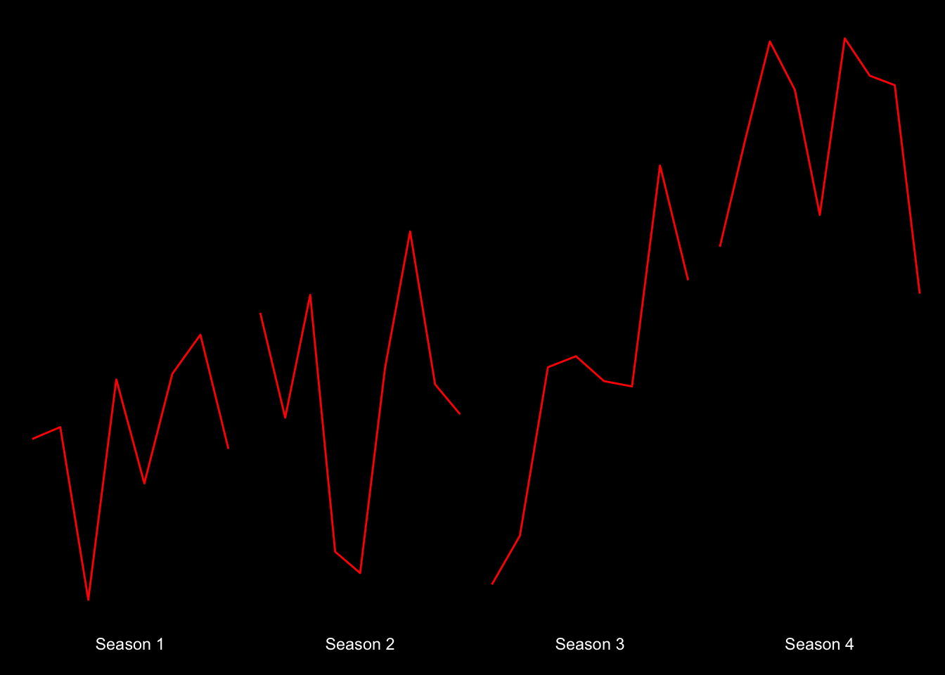 Okay…it’s starting to look pretty cool! What if we made the lines glow like the text does on the title page of the show? We can do just that with the ggfx package! And while we’re add it, how about we smooth out these trends a bit with smoothed lines to remove some of the noise (note that we’ll need to treate episode as numeric to get smoothed trends).
library(ggfx)

data_fear_norm_r %>%
  mutate(season = paste("Season",season),
         episode_l = paste("Ep.",episode)) %>%
  ggplot(aes(x = as.numeric(episode), y = fear_per_sec, group = 1)) +
   ggfx::with_outer_glow(geom_smooth(color = "red", size = 1, se = FALSE, span = .75),colour="red",sigma = 15, expand = 1.5) +
  labs(
    x = NULL,
    y = NULL
  ) +
  facet_wrap(~ season, ncol = 4, strip.position = "bottom", scales = "free_x") +
  theme(axis.text.x = element_blank(),
        axis.ticks.x = element_blank(),
        axis.text.y = element_blank(),
        axis.ticks.y = element_blank(),
        panel.grid = element_blank(),
        strip.background = element_blank(),
        strip.text = element_text(color = "white"),
        panel.background = element_blank(),
        panel.spacing = unit(0, "lines"),
        text = element_text(color = "red"),
        plot.background = element_rect(fill = "black", color = "black")
        )
## `geom_smooth()` using method = 'loess' and formula 'y ~ x'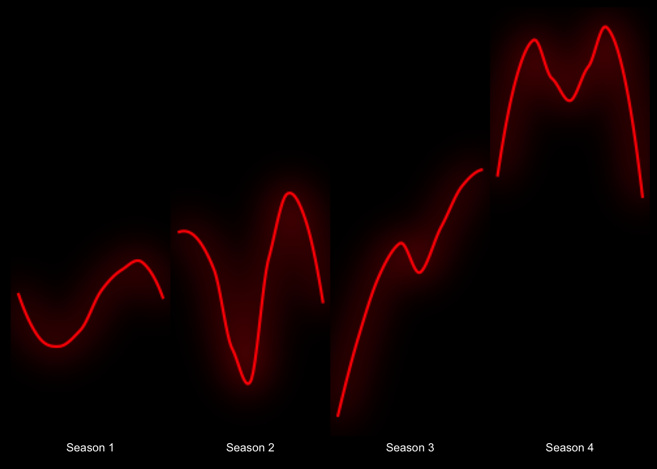 Now we’re talkin’! Okay, let’s start adding some text.
data_fear_norm_r %>%
  mutate(season = paste("Season",season),
         episode_l = paste("Ep.",episode)) %>%
  ggplot(aes(x = as.numeric(episode), y = fear_per_sec, group = 1)) +
   ggfx::with_outer_glow(geom_smooth(color = "red", size = 1, se = FALSE, span = .75),colour="red",sigma = 15, expand = 1.5) +
  #ggfx::with_outer_glow(geom_line(color = "red", size = 1),colour="red",sigma = 15, expand = 1.5) +
  labs(
    x = NULL,
    y = NULL,
    title = "Which season of Stranger Things is the scariest?",
    subtitle = "Trends in 'fear' sentiment across episode scripts",
  ) +
  facet_wrap(~ season, ncol = 4, strip.position = "bottom", scales = "free_x") +
  theme(axis.text.x = element_blank(),
        axis.ticks.x = element_blank(),
        axis.text.y = element_blank(),
        axis.ticks.y = element_blank(),
        panel.grid = element_blank(),
        strip.background = element_blank(),
        strip.text = element_text(color = "white"),
        panel.background = element_blank(),
        panel.spacing = unit(0, "lines"),
        text = element_text(color = "red"),
        plot.background = element_rect(fill = "black", color = "black"),
        plot.title = element_text(size = 20)
        )
## `geom_smooth()` using method = 'loess' and formula 'y ~ x'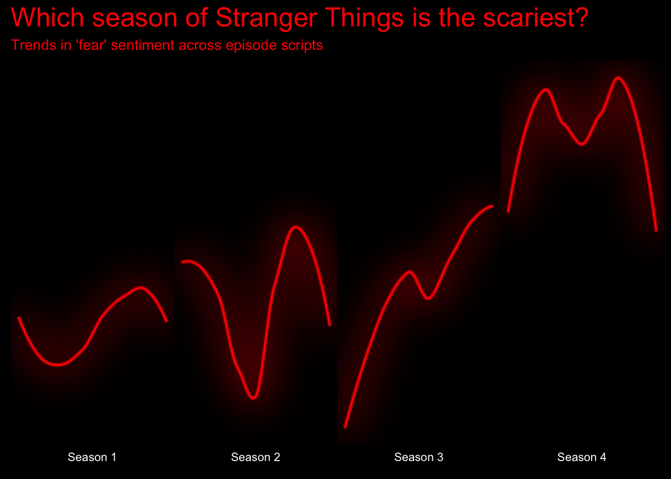
Good for now – we can tweak the content more later on. Let’s try to get teh Stranger Things plot on there. After a bit a googling, It appears that the font used for the title is called ITC Benguiat. I’ve downloaded that font to my computer, and I will make it available in ggplot using the showtext package.
library(showtext)## Loading required package: sysfonts## Loading required package: showtextdbfont_add(family = "BenguiatStd", regular = "/Users/seanbock/Library/Fonts/BenguiatStd-Bold.otf")
showtext_auto()
data_fear_norm_r %>%
mutate(season = paste("Season",season),
episode_l = paste("Ep.",episode)) %>%
ggplot(aes(x = as.numeric(episode), y = fear_per_sec, group = 1)) +
ggfx::with_outer_glow(geom_smooth(color = "red", size = 1, se = FALSE, span = .75),colour="red",sigma = 15, expand = 1.5) +
labs(
x = NULL,
y = NULL,
title = str_wrap("Which season of Stranger Things is the scariest?", width = 30),
subtitle = "Trends in 'fear' sentiment across episode scripts",
) +
facet_wrap(~ season, ncol = 4, strip.position = "bottom", scales = "free_x") +
theme(axis.text.x = element_blank(),
axis.ticks.x = element_blank(),
axis.text.y = element_blank(),
axis.ticks.y = element_blank(),
panel.grid = element_blank(),
strip.background = element_blank(),
strip.text = element_text(color = "white", size = 15),
panel.background = element_blank(),
panel.spacing = unit(0, "lines"),
text = element_text(color = "red", family = "BenguiatStd"),
plot.background = element_rect(fill = "black", color = "black"),
plot.title = element_text(size = 30)
)## `geom_smooth()` using method = 'loess' and formula 'y ~ x'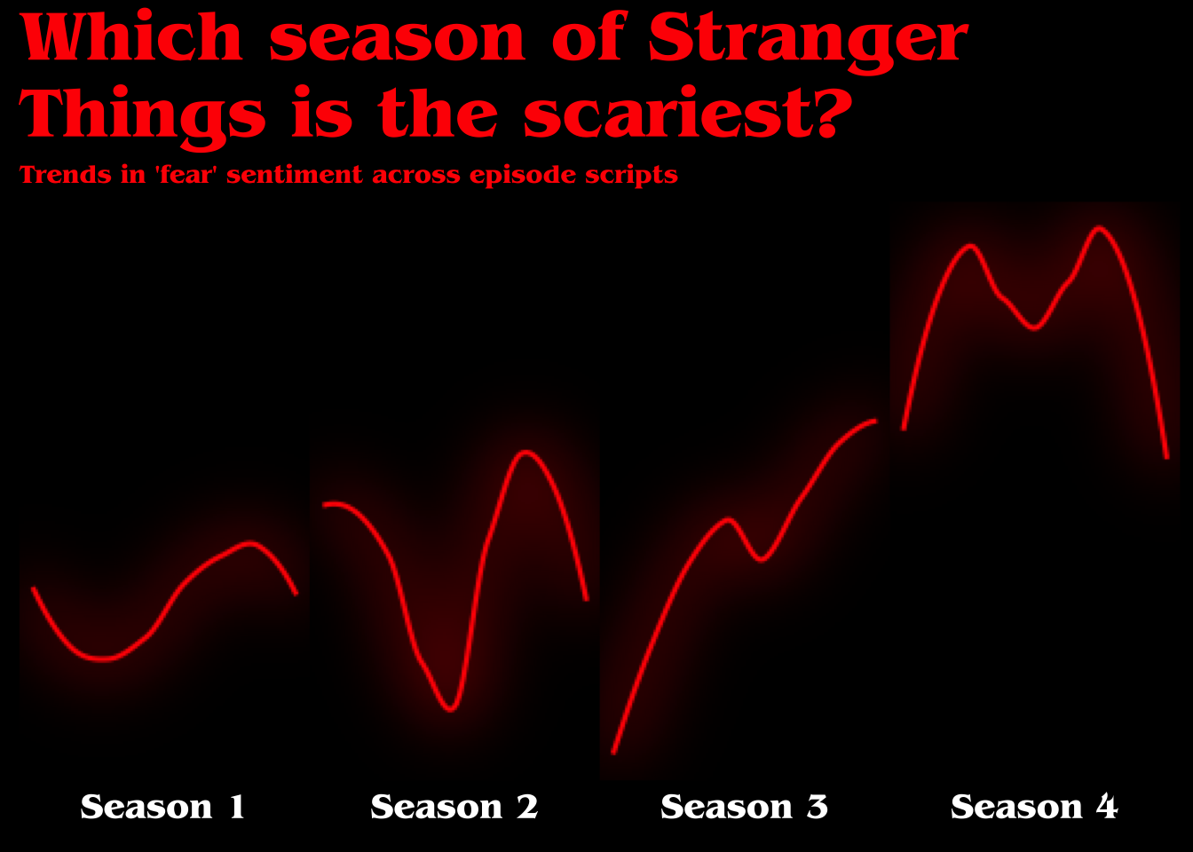
Now it’s really looking like something out of Stranger Things! Now for some final touches. Let’s increase the margins of the plot and add a caption at the bottom explaining what we did.
library(showtext)
font_add(family = "BenguiatStd", regular = "/Users/seanbock/Library/Fonts/BenguiatStd-Bold.otf")
showtext_auto()
data_fear_norm_r %>%
mutate(season = paste("Season",season),
episode_l = paste("Ep.",episode)) %>%
ggplot(aes(x = as.numeric(episode), y = fear_per_sec, group = 1)) +
ggfx::with_outer_glow(geom_smooth(color = "red", size = 1, se = FALSE, span = .75),colour="red",sigma = 10, expand = 1) +
labs(
x = NULL,
y = NULL,
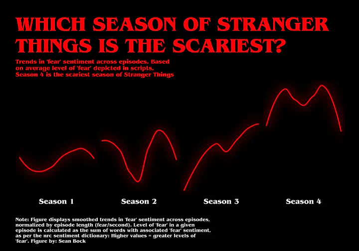
title = str_wrap("WHICH SEASON OF STRANGER THINGS IS THE SCARIEST?", width = 30),
subtitle = str_wrap("Trends in 'fear' sentiment across episodes. Based on average level of 'fear' depicted in scripts, Season 4 is the scariest season of Stranger Things", width = 50),
caption = str_wrap("Note: Figure displays smoothed trends in 'fear' sentiment across episodes, normalized by episode length (fear/second). Level of 'fear' in a given episode is calculated as the sum of words with associated 'fear' sentiment, as per the nrc sentiment dictionary: Higher values = greater levels of 'fear'.\nFigure by: Sean Bock", width = 75)
) +
facet_wrap(~ season, ncol = 4, strip.position = "bottom", scales = "free_x") +
theme(axis.text.x = element_blank(),
axis.ticks.x = element_blank(),
axis.text.y = element_blank(),
axis.ticks.y = element_blank(),
panel.grid = element_blank(),
strip.background = element_blank(),
strip.text = element_text(color = "white", size = 15),
panel.background = element_blank(),
panel.spacing = unit(0, "lines"),
text = element_text(color = "red", family = "BenguiatStd"),
plot.background = element_rect(fill = "black", color = "black"),
plot.title = element_text(size = 40),
plot.subtitle = element_text(size = 12),
plot.caption = element_text(size = 10, hjust = 0, color = "white", vjust = -5),
plot.margin = unit(c(1.25,1,1,1), "cm"),
)## `geom_smooth()` using method = 'loess' and formula 'y ~ x'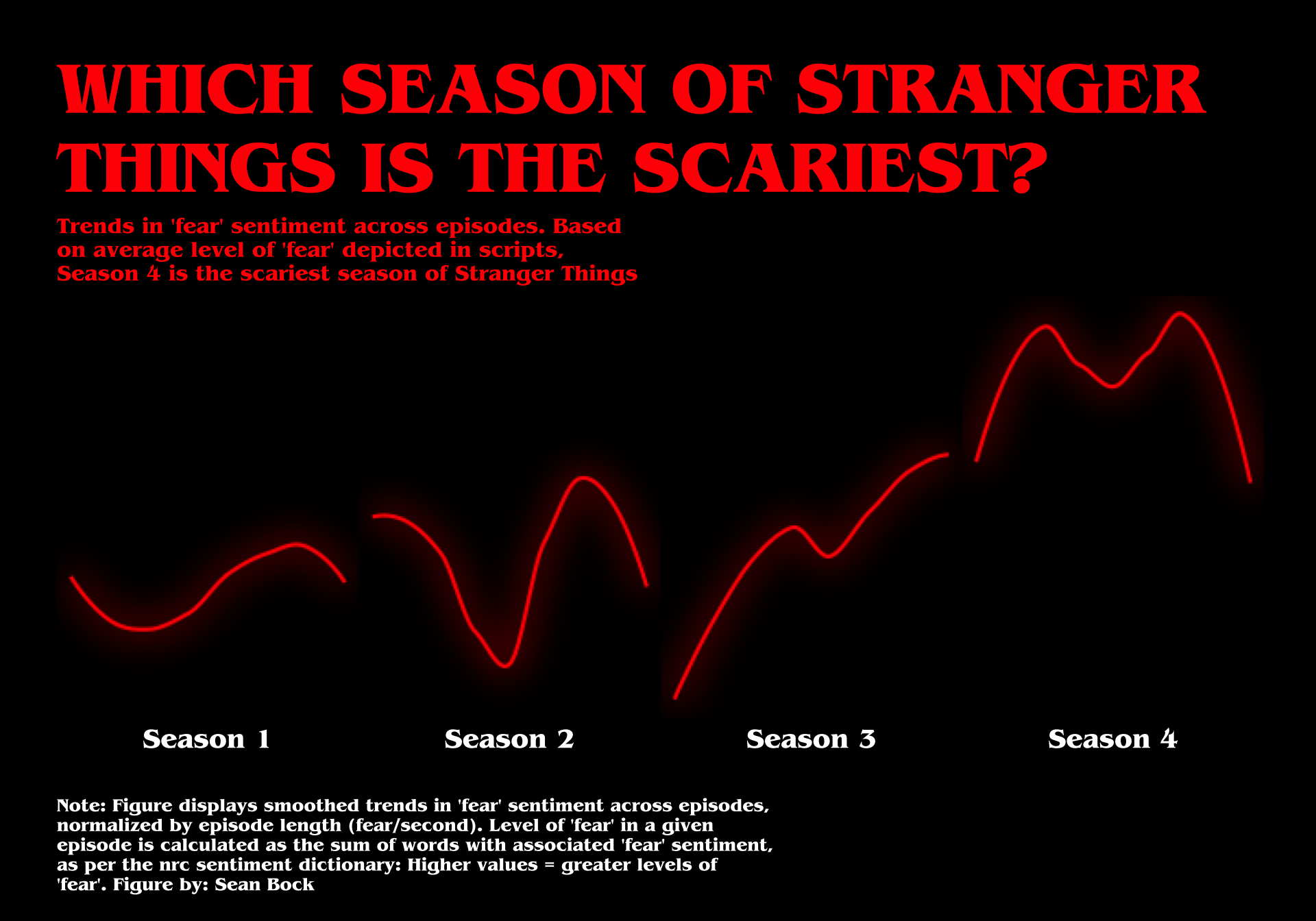
I think we’re done here!
Sean Bock
Research Scientist | Demography and Survey Science
I am interested in Quantitative Research, Natural Language Processing, Survey Research, and Data Visualization