How to recreate plots produced by geom_smooth()
One of the most convenient features of ggplot is the ability to quickly fit regression lines through some points. Even more impressive is the ability to do this over a grouping variable with aesthetic parameters such as color or group, resulting in several regressions being fit and plotted in a matter of seconds. But have you ever wondered how ggplot is producing these plots, or have you ever wished to tweak the underlying models used?
I’ve found attempting to manually replicate the model plots produced from geom_smooth() to be an incredibly useful exercise. Not only does it help you to better understand what’s going on under the hood with ggplot (which I think is important), it also helps with the modeling and visualization process, as you may find yourself wanting to create a plot that looks similar to what is produced from geom_smooth(), but with more control over the underlying model specification.
Let’s replicate a plot! For this exercise, we’ll be using the gapminder data, which includes over-time life expectancy and economic measure data for countries.
Loading libraries
pacman::p_load(tidyverse, broom, gapminder)Loading data
data <- gapminder

glimpse(data)
## Rows: 1,704
## Columns: 6
## $ country <fct> "Afghanistan", "Afghanistan", "Afghanistan", "Afghanistan", …
## $ continent <fct> Asia, Asia, Asia, Asia, Asia, Asia, Asia, Asia, Asia, Asia, …
## $ year <int> 1952, 1957, 1962, 1967, 1972, 1977, 1982, 1987, 1992, 1997, …
## $ lifeExp <dbl> 28.801, 30.332, 31.997, 34.020, 36.088, 38.438, 39.854, 40.8…
## $ pop <int> 8425333, 9240934, 10267083, 11537966, 13079460, 14880372, 12…
## $ gdpPercap <dbl> 779.4453, 820.8530, 853.1007, 836.1971, 739.9811, 786.1134, …Ploting means
For this example, I’m going to look at life expectancy over time by continent. Before going straight to fitting a regression, I’m going to plot trends in means to get a sense of the overall patterns.
theme_set(theme_classic()) ## setting plotting theme


data %>%
  group_by(continent, year) %>%
  summarize(avg_life = mean(lifeExp)) %>%
  ggplot(aes(x = year, y = avg_life, color = continent)) +
  geom_point() +
  geom_line() +
  scale_color_manual(values = continent_colors) + # gapminder includes these!
  labs(
    title = "Average life expectancy over time by continent",
    x = "Year",
    y = "Average life expectancy",
    color = "Continent"
  )
## `summarise()` has grouped output by 'continent'. You can override using the
## `.groups` argument.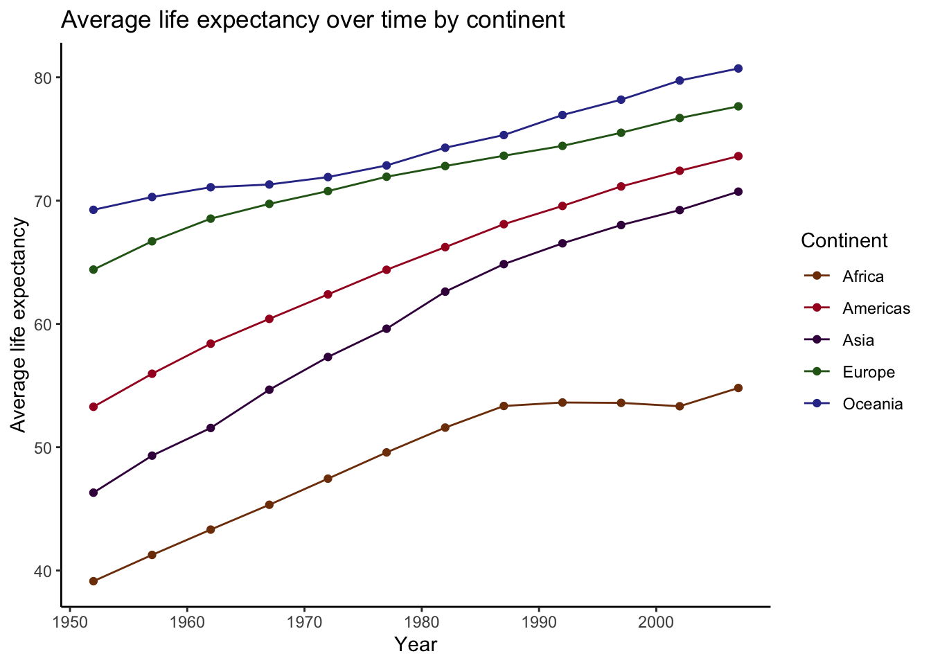
Overall, these trends look fairly linear, with each continent having increased average life expectancy since the early 50’s. However, there is enough nonlinearity here that a nonparametric approach, such as loess smoothing, is probably a good way to go here.
Plotting smoothed trends
Let’s plot these trends again, but this time, we will use geom_smooth() to model the nuances of these trends.
(
plot_smooth <-
  data %>%
  ggplot(aes(x = year, y = lifeExp, color = continent)) +
  geom_smooth(se = FALSE, method = "loess", span = .3, size = .75) + # I'm lowering the span here so that the lines are a bit wigglier. This will make the demo clearer later on.
  scale_color_manual(values = continent_colors) +
  labs(
    title = "Average life expectancy over time by continent",
    x = "Year",
    y = "Average life expectancy",
    color = "Continent"
  )
)
## `geom_smooth()` using formula 'y ~ x'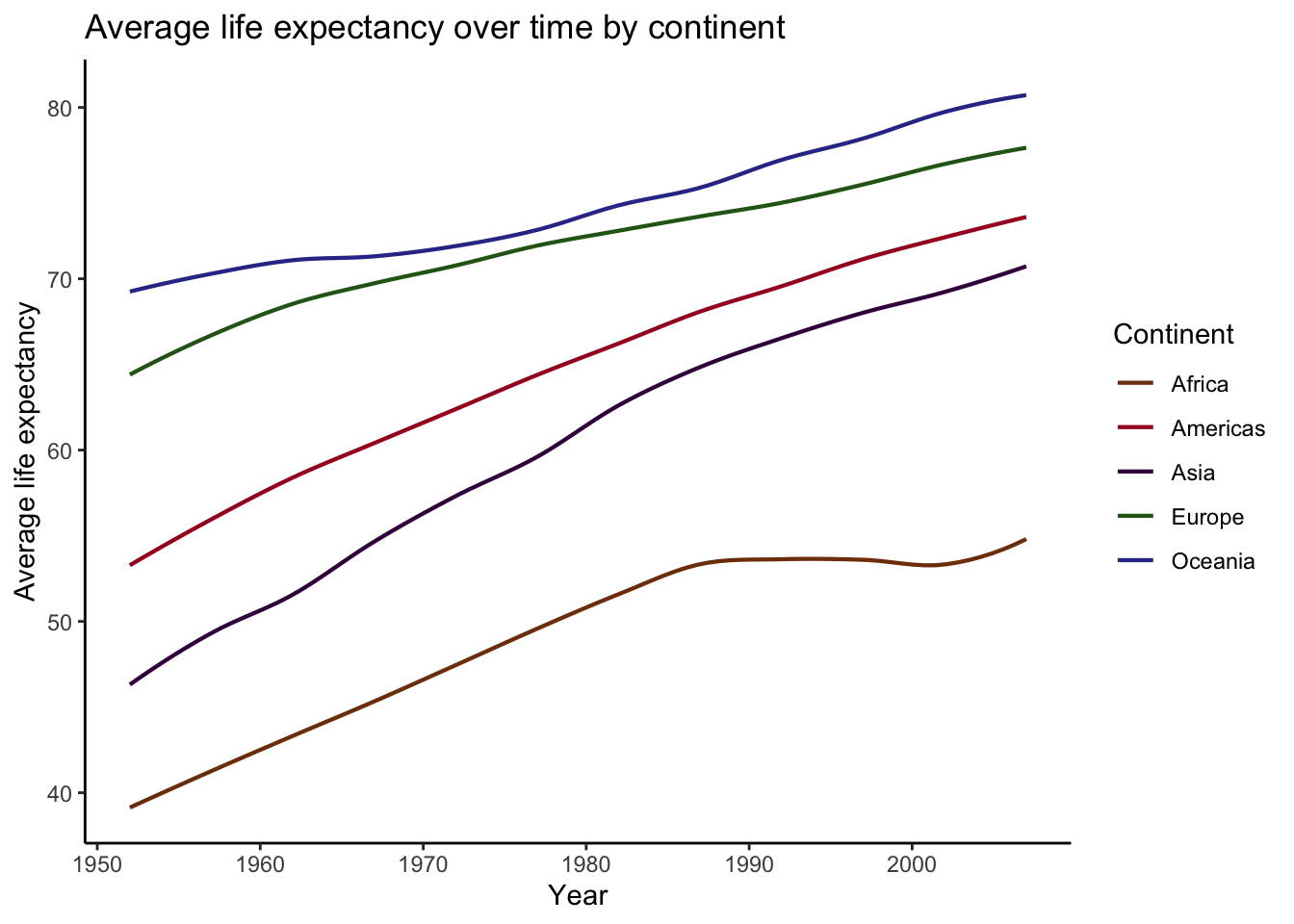
Beautiful! The power of geom_smooth().
Recreating smoothed plot
Now let’s try to recreate this thing from scratch. In short, what ggplot is doing is 1) fitting a loess regression (i.e., loess(LifeExpectancy ~ year)), 2) calculating the predicted values, and 3) plotting. What makes this a bit more complicated in this case is that because there is a grouping variable (Continent), it performs steps 1 and 2 for each level of the grouping variable. That means that in order to recreate the plot produced by geom_smooth(), we will have to fit 5 separate regressions, calculate their predictions, and then plot them! Sounds like a lot, but luckily, the combination of nest() and map() make this process rather easy.
preds <-
data %>%
group_by(continent) %>%
nest() %>% # Create nested tibble by continent
mutate(model = map(data, ~ loess(lifeExp ~ year, data = .x, span = .3)), # fit loess model for each continent
preds = map(model, augment)) %>% # calculate predictions from each model
unnest(preds) # return tibble of predictions
# Now adding predictions with geom_line() to first plot we created
plot_smooth +
geom_line(data = preds,
aes(x = year, y = .fitted, group = continent, color = continent),
linetype = "dotted", size = 2) +
labs(
title = "Life expectancy over time by continent",
subtitle = "Comparing trends estimated by geom_smooth() vs. manual estimations (dotted lines)",
x = "Year",
y = "Life expectancy",
color = "Continent"
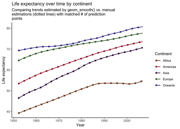
)## `geom_smooth()` using formula 'y ~ x'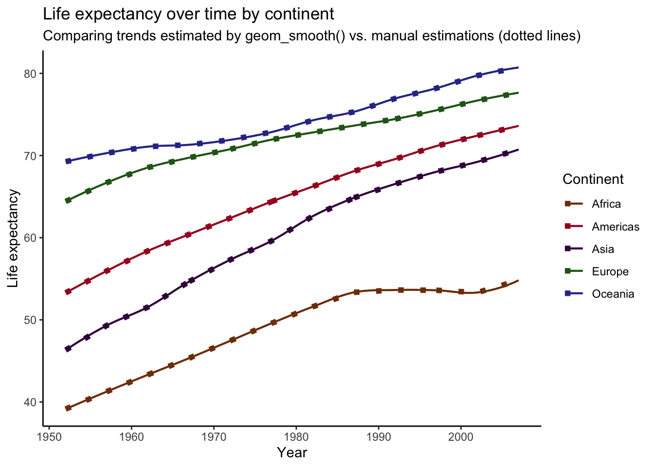 For comparison, I’ve overlaid our manually-produced trends (dotted lines) on top of the plot we produced before. As you can see, It looks like we’ve successfully recreated the plot produced by
 geom_smooth()! However, if you look closely, you might notice that the lines deviate in some spots. For example, the end of the trend line for Africa is slightly off. This is a small difference, but these plots should be the same. What’s going on?
Turns out that these discrepancies are due to differences in the data points use to calculate predictions from the models. See, when we calculated the predictions for each continent above, we did not specify any new data on which to make the predictions, meaning that predictions were calculated for every year value in the data (the data used to fit each model). To illustrate this, we can compare the number of unique years in the data and the number of points used in our prediction plot.
data %>%
  distinct(year) %>%
  nrow()
## [1] 12preds %>%
ggplot(aes(x = year, y = .fitted, color = continent)) +
geom_point()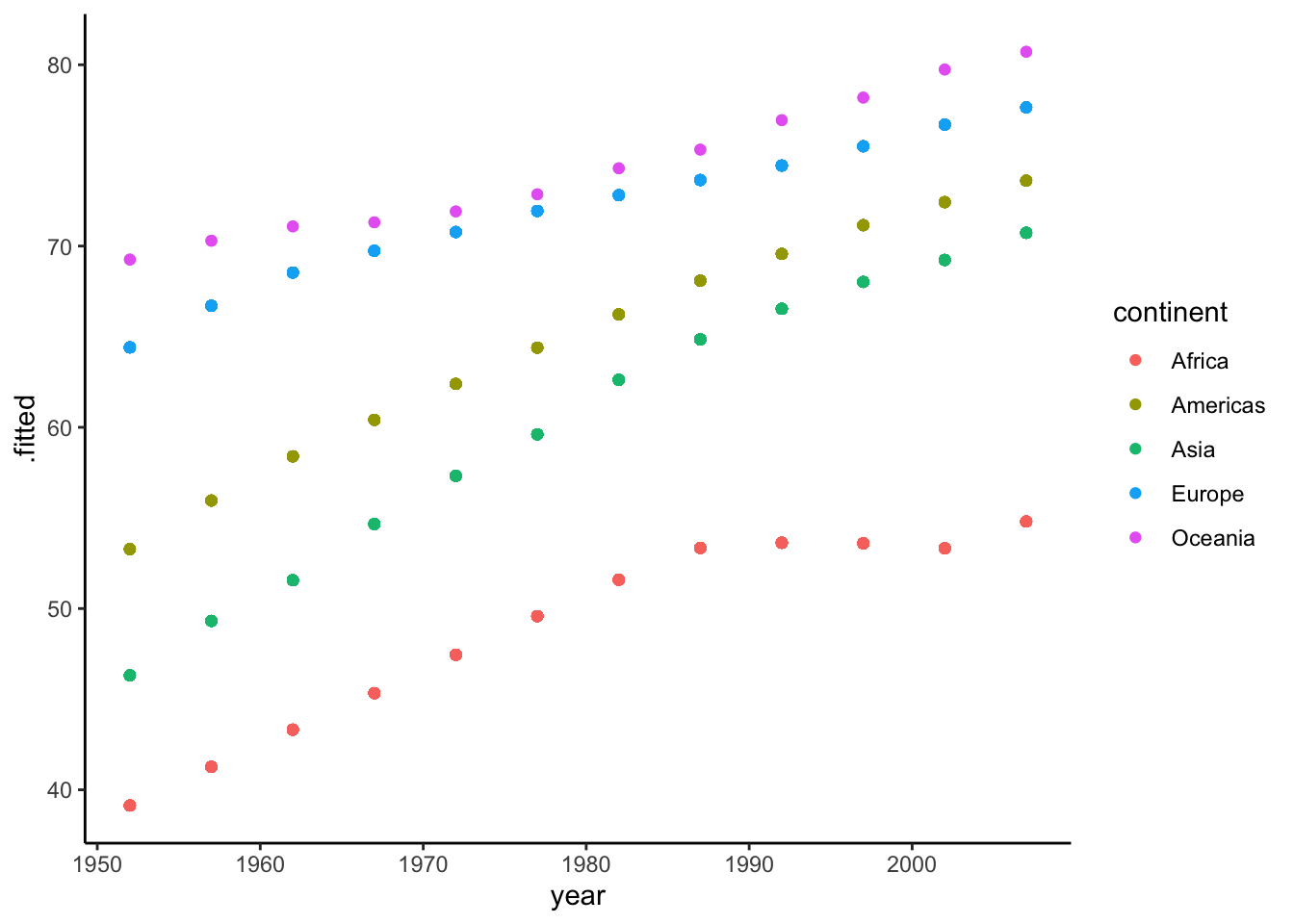 So there are 12 unique year values in our data (12 waves of data), and this matches the 12 points that make up each trend line in our plot. Again, when we calculate predictions from our models without specifying new data to predict on, the predictions are calculated from the values in the data, as illustrated above. Turns out, though, that this isn’t what
 ggplot does when plotting model results. Instead, it determines an optimal number of points (for graphical purposes) to use for predictions with each line.
In short, the number of prediction points used to plot the trend lines differs between the plot we created and the plot produced by geom_smooth(). Therefore, to replicate the geom_smooth() plot, we will need to 1) find the data used by geom_smooth() to create predictions, and then 2) use those data to generate our own predictions. To find out what data was used, we’ll need to inspect the plot. A neat function ggplot_build() allows us to examine the underlying structure of the plot_smooth object. After calling the ggplot_build() function on the plot, we can locate the data used in constructing it.
build <- ggplot_build(plot_smooth) ## returning structure of plot## `geom_smooth()` using formula 'y ~ x'df_preds <- build[["data"]][[1]] ## where the dataframe is located
df_preds %>% # examining points
count(x) %>%
head()## x n
## 1 1952.000 5
## 2 1952.696 5
## 3 1953.392 5
## 4 1954.089 5
## 5 1954.785 5
## 6 1955.481 5Aha! The “x” column here displays the points used along the x-axis (year), and it looks like there are 80 of them. “n” is 5, because there are five trends lines. These are the year values used to generate predictions for each continent! Instead of only using the 12 available year values in our data to generate each trend line, ggplot is using 80! The greater number of prediction points results in a more aesthetically pleasing plot, as the lines are “smoother.” Now that we’ve figured out which year values are used to calculate predictions, we can store these values and use them in our own prediction calculations.
Grabbing year values and storing as df.
new_year <- df_preds %>%
  distinct(x) %>%
  rename("year" = x) # column name must match name in model data
Now we can repeat what we did above, but this time we will use the values from new_year for the newdata argument inside of augment().
preds2 <-
data %>%
  group_by(continent) %>%
  nest() %>%
  mutate(model = map(data, ~ loess(lifeExp ~ year, data = .x, span = .3)),
         preds = map(model, ~ augment(.x, newdata = new_year))) %>%
  unnest(preds)
Now that we have our updated predictions, let’s once again compare to the original plot created by geom_smooth()
plot_smooth +
  geom_line(data = preds2,
            aes(x = year, y = .fitted, color = continent),
            linetype = "dotted", size = 2) +
  labs(
    title = "Life expectancy over time by continent",
    subtitle = str_wrap("Comparing trends estimated by geom_smooth() vs. manual estimations (dotted lines) with matched # of prediction points", width = 60),
    x = "Year",
    y = "Life expectancy",
    color = "Continent"
  )
## `geom_smooth()` using formula 'y ~ x'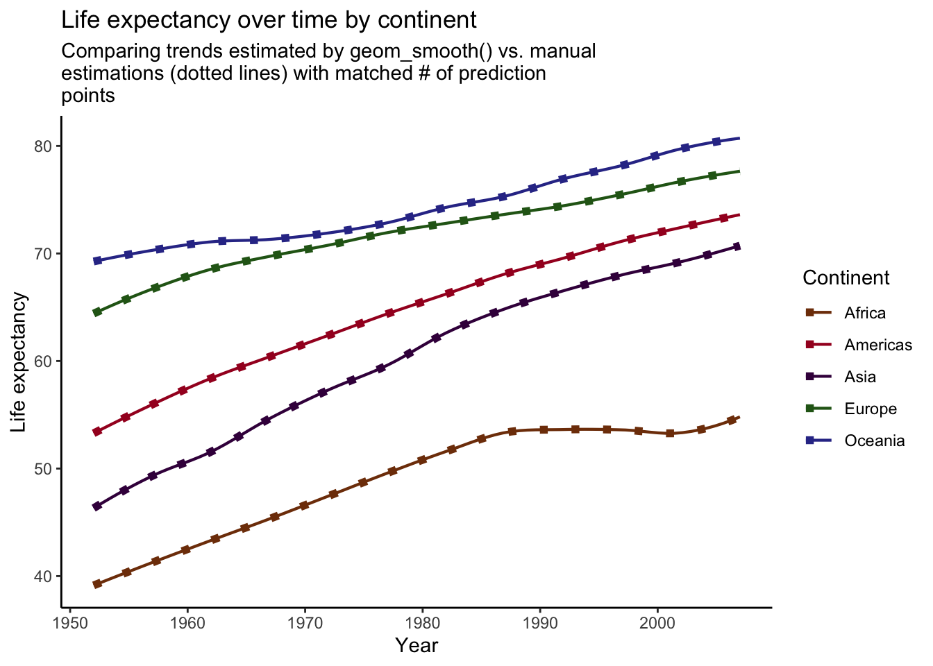
Voila! Our manually created trend lines now perfectly match the lines produced by geom_smooth().
Summary
In this post, I’ve demonstrated how to manually recreate plots produced by the geom_smooth() function from ggplot. We’ve learned that in order to replicate such plots correctly, you must examine the ggplot object to determine the values that were used to calculate predictions. Once these values are ascertained, one can run models, calculate predictions using the correct data on which to predict, and plot the results, perfectly matching the output from geom_smooth(). This can be a useful process to perform when you want to manually create plots of model results, but still want the general appearance achieved by geom_smooth().
Sean Bock
Research Scientist | Demography and Survey Science
I am interested in Quantitative Research, Natural Language Processing, Survey Research, and Data Visualization